
As we are in the midst of another holiday sales season, it’s a perfect time to examine the intersection of design, marketing, and sales techniques.
The best design clearly communicates a message or concept. Great design can compel someone to action. Being an ethical designer (and a good human being) means considering the people who are using the product you are creating.
Unethical design can be used to manipulate the end user into taking an action they may not have taken otherwise. There is a difference between an ordinary sales page, and one designed to subtly deceive the audience.
Because the consumer of the product is not always aware of the manipulation, these tactics are known as dark patterns. One can also describe these strategies more generally as deceptive design practices. We will take a look at a few examples in this post.
What is a Dark Pattern?
A dark pattern is a user interface (UI) convention designed to trick an end user into taking a specific action they didn’t intend, such as purchasing something or signing up for a service.
Dark patterns can take the form of strategically placed buttons, default interface selections, wording that is confusing, or styling that obscures the true purpose of the interface.
Largely unnoticed by the end user, some dark patterns occur in the background–such as adding an extra item to a shopping cart.
Deceptive Design
There are other interface design patterns not necessarily designed to trick people, but are used to apply sales pressure. Some of these techniques are just effective marketing, while others are actually deceptive.
Similar to dark patterns, a deceptive design pattern is an intentionally misleading user interface (UI) element intended to pressure an end user into taking a specific action, often to make a purchase.
These design patterns work by bypassing our rational decision making process and tapping into universal instincts and desires. Even users who are aware of the pattern are susceptible to it.
We’ll look at a few examples here to demonstrate how they work. Keep them in mind as you shop online. Within your design practice, try to consider the end user while building sales pages.
Create a Sense of Urgency
We’re likely all familiar with the “limited-time offer.” A sale by definition is a price reduction for a limited period of time, or within some other constraint such as the amount of merchandise on hand.
The old-school, TV infomercial-style language for these sales might include phrases such as “act now,” “supplies are limited,” and “while supplies last.” Crazy Egg suggests some more effective language including “last day,” “today only,” or “ends on Friday at midnight.”
From a design standpoint, there are different ways to create urgency around a time-sensitive offer. With Black Friday in the not too distant past, you can probably think of some examples that landed in your email inbox.
Timers
One example that comes to mind immediately is a countdown timer on a sales page. We’ve all seen them–the ubiquitous Black Friday countdown. They make an appearance every year on Black Friday, Cyber Monday, and holiday sales pages.

Timers are not necessarily a dark pattern or deceptive design. They may be a little overused at this point. But as long as the sale ends when the timer suggests it ends, they are not misleading.
However, if the sale is automatically extended after the end date, and the timer starts again with a new countdown, the sales page is deceptive. The limited offer signified by the timer was not actually limited. The only function of the timer was to manufacture a feeling of urgency.
Often, you will see timers that reset on sales pages advertising a webinar. The timer suggests that the webinar is starting shortly, and it’s a limited-time offer. However, expect a new sales page after the timer expires featuring the same, pre-recorded webinar.

The offer ends shortly.

Just kidding!
Create Scarcity
By examining the following UI component on a sales page, you might get the impression that the item is limited in quantity. The company has a specific number of products, and the number sold is getting very close to the amount available.
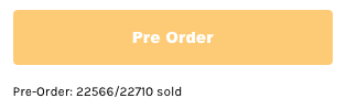
If you are at all interested in the product, you are likely experiencing a small amount of stress from the relative scarcity of the item. The product available is running out, and other people are quickly buying the item that you want. You should act now!
Why This is Deceptive
However, if we take a look at the same sales page a few hours later, the quantity of items available has increased. The number of items sold is still close to the total number available.
The number of products in stock is not accurately represented on this sales page. It’s just an interface element designed to increase your FOMO (fear of missing out).

Here is another example for a different product. The same principle applies, it’s just in a different format. The number of products is reduced regularly, by the minute. It creates the illusion that the number of products is very limited, and other people are quickly buying up the supply.

Checking back hours later, the product is still available, and the countdown for the items in stock seems to stall out around 18 items. Checking back days later, and the timer is reset. From there, the same pattern occurs–a regular countdown that stops at 18 items.
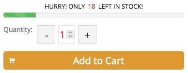
You can actually buy an add-on for your Shopify store that will do all this for you. It may generate sales, but the ethics of this approach are questionable.
Displaying the amount of products remaining is absolutely fine. However, these graphics don’t seem to have any correlation to the actual amount of items in stock. This is merely a manipulative design convention, designed to create a perception of scarcity and inspire a purchase.
Apply Pressure
Another clever UI convention used on many sales pages is a pop-up graphic in the lower left corner of the page that indicates when people are buying the product.
This appears consistently at regular intervals, about every 15-30 seconds. It generates the impression that someone just bought the product as you were sitting there looking at the page. Often, the location is displayed along with the purchaser’s name.

This is a common design pattern that you will find on sales pages across the internet. At least with reputable companies, these are based on actual purchases.
However, these types of widgets use past purchase data to create an activity stream. It’s likely that the person featured in the pop-up did not actually just buy the item a minute ago.
In fact, there is usually some small type at the bottom of the widget that tells you when the purchase was made (five hours ago, two days ago, etc.).

So this is not truly deceptive, but a bit misleading. It reinforces the sense of urgency and scarcity already established by the rest of the sales page.
These graphics appeal to the natural human desire to be part of a group, and to follow the wisdom of the crowd by making a purchase. This is also known as social proof.
Create an Illusion of Choice
Pricing options are often used on sales pages, frequently in a group of three. The lower and higher-priced options are used to frame the middle option, making it appear to be the best deal by comparison. This can lead to a consumer spending more than intended.
Pricing options make sense when there is a notable difference between the options. However, just be aware of it as a design pattern and marketing strategy. Consider whether you need that mid or higher-priced option when you were just intending to buy the lower-priced item.
See Buffer’s discussion of the “decoy effect” for some insights about this strategy.
Influencer Marketing
It’s worth noting how influencer marketing can be combined with an effective sales page to amplify the sales pressure. Let’s consider the following scenario.
We have a new product on offer. The company sends the product to a popular YouTube personality. The influencer demos the product on their YouTube channel, creates a favorable review, and links to an effective sales page.
Influencer marketing works because it’s not always clear how the promoter is being rewarded. Perhaps it’s with a free product, or maybe it’s a percentage based on the number of sales. The influencer has built up trust with their audience, and the average viewer feels that they are getting a product recommendation from a friend or a trusted expert.
In reality, the review was done in exchange for compensation of some sort. Can we trust that the review is unbiased?
Keep Users Hooked
It’s telling that the language of software, the web, and marketing use terms that are applicable when speaking about illicit substances. Individuals are referred to by the term, “user.” While appropriate, it does seem somewhat callous.
Some common goals of marketing are to increase conversions, increase engagement, and increase time on site. You will be aware of methods to accomplish the latter goal, increasing time on site.
Endless Scroll
For example, take your favorite social media platform as an example. Have you ever reached the bottom of the page? You haven’t because the feed is endless. There is always a constant supply of new information creating an endless page. You keep scrolling on the chance that there is something new and engaging.
This is similar to how a slot machine works. People keep pulling the lever of the slot machine because there is a chance that there may be a payoff. There is a high level of visual and auditory stimulus keeping the player engaged in the meantime. There is no end to the game, it just keeps going.
Autoplay
The same endless scroll technique has been applied to streaming video as well. Most streaming video platforms automatically play the next video at the end of the current video by default. Some graciously provide a way to turn this feature off. The time to start the next video is a matter of seconds making it difficult to stop. This encourages more time spent on the platform.
Have you ever found yourself well past your bedtime wondering how you just watched five episodes of a show? Well you can thank the evil geniuses behind the autoplay feature.
Bring Users Back
If you’ve ever purchased anything online or signed up for any service, you know the annoying persistence of marketing emails. This can be as benign as promoting the latest sale, or keeping you up to date with the latest articles on the site. But when combined with browser fingerprinting, it can be more insidious.
As an example, there is a site I use to buy bicycling-related products. I unsubscribed from their marketing emails and I’m signed out of the website. However, due to browser fingerprinting, I was sent a reminder email about some products the day after browsing those products.
This is not inherently bad, but I would characterize it as a dark pattern. It’s happening behind the scenes without the end user being aware.
Side note, you might consider Firefox instead of Chrome for web browsing, as it blocks browser fingerprinting by default. Browser add-ons such as Ghostery and Adblock Plus are not quite enough to block browser fingerprinting.
Dark Patterns in the Analogue World
What can I do to get you in this car today?
Have you ever bought a car? If so, you may know the frustrating experience of dealing with questionable sales tactics. If you’ve ever financed a vehicle through a dealer, you will have been presented a series of options for the pricing. These options all included extra warranties that you did not ask for, and do not need.
The auto dealers make money by selling these extended warranties. If you look closely at the fine print, you’ll see that it’s a third party warranty, and has nothing to do with the auto manufacturer.
This is deceptive because there is no option for the financing without the warranty unless you ask for it. Each option is presented in a similar format we see on the web, giving you the illusion of choice, and the sense that one of these options is the best deal. It’s a trap!
It may be implied that these warranties are official in some way, even though they are not associated with automakers.
Do you want a credit card with that?
If you’ve ever bought anything from a department store, you’ve likely been sold a store credit card. You sign up for a new card in exchange for 20% off your purchase today, or something similar.
This is deceptive because you did not need or want a new credit card. And the sales pitch hits you when you are vulnerable. You think you have completed the transaction and your defenses are down. Just then, the salesperson pressures you with a new deal.
Depending on how persistent the salesperson is and your state of mind, you may be receptive to the deal, or you may sign up just to end the transaction and get out of the store.
The takeaway is that these deceptive techniques on the web are not new. The tactics are the same, they have just been translated to our digital age.
The Downside of Dark Patterns
While these strategies and design patterns are effective, they do have drawbacks that will be experienced over the long term. It can create customer hostility. Customers might feel manipulated, and before they even receive the product, you’ve created a bad impression with your brand.
After a cooling off period, your customers may rethink the purchase when their rational decision making process kicks in. The initial activity of the purchase can be followed by buyer’s remorse. Customers might return the product or ask for a refund before it ships.
What does all this tell us? Marketing is effective. These patterns, dark or not, do work. As consumers, we should be aware of them when we are entering into a sales situation.
Advocate for Ethical Design
Most of the web is now a commercial space. There are very few areas of the web left that are non-commercial. Even nonprofits use some of these strategies in their marketing emails and donation pages.
If you are designing for the web, be an advocate for ethical design. Convince your clients that dark patterns do more harm than good. More sales may be generated in the short term, but these deceptive design patterns are detrimental to long term business.
Aim for a persuasive sales page, not a manipulative one. There is an opportunity here to rethink some of the tired design patterns and come up with something new. Use your skills as a designer to challenge the conventions.